
Privacy Policy

Brand Positioning
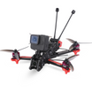
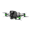
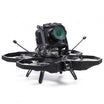
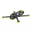
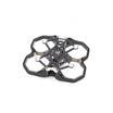
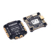
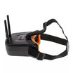
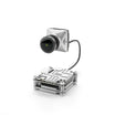
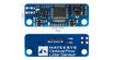
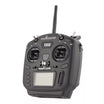
At InsideFPV, we redefine the skies with cutting-edge
technology and customized Ready to Fly FPV drones,
making us India's premier destination for immersive
aerial experiences. As a government-recognized startup under DPIIT and incubated by VITTBI, our expertise and innovation shine through. With a spotlight on Shark Tank India Season 2, we are trusted pioneers, delivering unrivaled performance, quality, and personalization for every flight.
Brand Voice
insideFPV Logo Variations
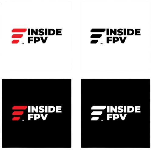
Logo (Primary)
_
Our primary brand logo is shown in it’s native setting in the right, consisting of the symbol and the text elements.
The primary logo should be setup on the white background with text elements in black but it can also be used over a black background with the text elements in white color.
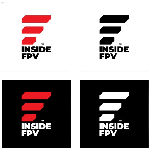
Logo (Secondary)
_
Our secondary brand logo is shown in it’s native setting in the right, consisting of the symbol and the text elements.
The secondary logo should be setup on the white background with text elements in black but it can also be used over a black background with the text elements in white color.
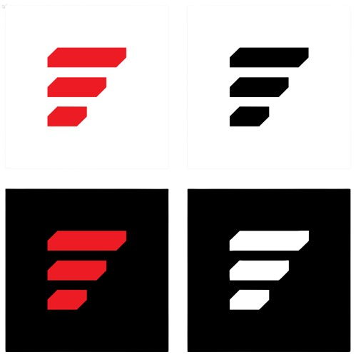
Logo (Lettermark)
_
The primary logo symbol may be isolated and used on its own in a variety of scenarios where the text elements are not needed or are deemed illegible.
LOGO Uses
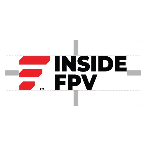
Logo (Primary)
The placement of the logo is key to its impact and effectiveness. Always ensure that you leave the minimum ‘clear space’ to give it the breathing room it requires, whether that be coloured background, over a photo or a video. If the clear space is applied properly, the logo should never touch the content border of any graphic canvas, or contain any visual elements.
The minimum clear space is calculated based on the height of the uppercase ‘I’ from the ‘Inside’ text. In our case, the minimum clear space should the total x-height of the uppercase ‘I’ shown on the right diagram.
Logo (Secondary)
The minimum clear space for the secondary logo is also calculated based on the height of the uppercase ‘I’ from the ‘Inside’ text. In our case, the minimum clear space should the total x-height of the uppercase ‘I’ shown on the right diagram.
Logo (Lettermark)
The minimum clear space for the secondary logo is also calculated based on the height of the uppercase ‘I’ from the ‘Inside’ text. In our case, the minimum clear space should the total x-height of the uppercase ‘I’ shown on the right diagram.
insideFPV
Logo Usage
- Do not rotate the logo.
- Do not type out the logo text.
- Do not violate the clear space.
- Do not use gradients or shading.
- Do not reposition any logo elements.
- Do not adjust the transparency of the logo.
- Do not render under poor resolution or sharpness.
- Do not place the logo in any graphic shape or border.
- Do not use the text elements of the logo on their own.
- Do not change the size of the individual logo elements.
- Do not apply an outline effect any of the logo elements.
- Do not apply drop shadow, filters or any graphic effects.
- Do not use any foreign swatch on any of the logo elements.
- Do not stretch or alter the logo in any way, shape or form.
- Do not create repeating patterns with any of the logo elements.
- Do not place the logo over imagery or graphic that deem it illegible.
Brand Colors
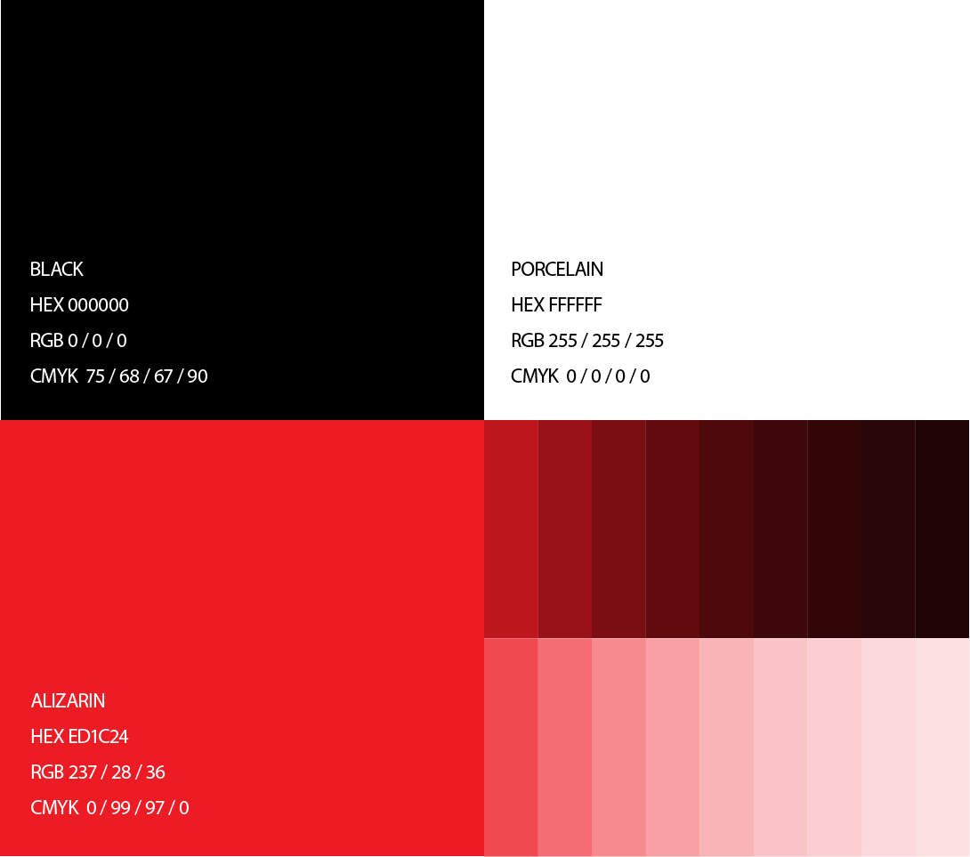
Core Brand Colors
_
Our color palette consists of two main swatches
in Black and Porcelain, accompanied by a suite
of hues of Alizarin. When designing for print, try
to ensure you test each color by printing out
proofs before sending it off for production. RGB
and CMYK values rarely match perfectly, and
always require some adjustments in each
individual scenario.
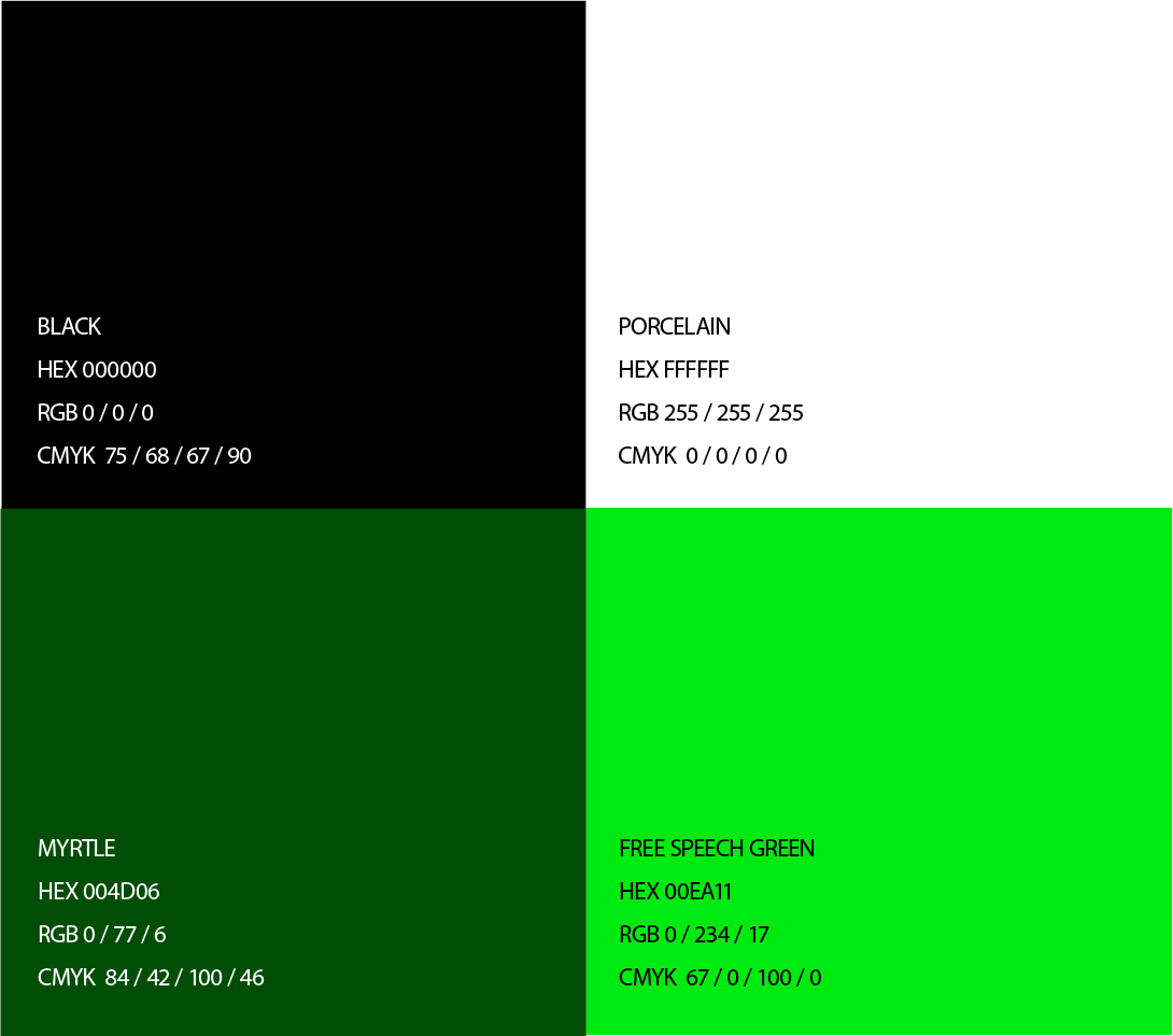
Defence & Agriculture
_
The InsideFPV Defence & Agriculture color palettes
are shown in the right to be used when producing media for the respective domains. For example, when designing a sub-page on a website dedicating to Defence, the green colour will be used as the highlight and/or background color, alongside with the core Porcelain & Black. You are also free to use the tints/shades of these colors as well if required.
Fonts & Typography - Poppins
Primary Font
Typography is one of the most important parts of the brand voice, in a visual sense.
It must be meticulously executed with care according to proper specifications.
Our brand typeface is called Poppins.
The Bold & above weights should be used for all headlines and titles, sub-headlines and certain call-to-actions. It must never be set
in all caps unless forced to do so under a rare and specific media requirement.
The Medium & below weights should be used for sentences, paragraphs, labels and lists.
Poppins Bold
ABCDEFGHIJKLMNOPQRSTUVWXYZ
abcdefghijklmnopqrstuvwxyz0123456789
The Quick Brown Fox Jumps Over The Lazy Dog
The Quick Brown Fox Jumps Over
The Lazy Dog
The Quick Brown Fox
Jumps Over The Lazy Dog
Poppins Medium
ABCDEFGHIJKLMN OPQRSTUVWXYZ abcdefghijklmnopqr stuvwxyz0123456789
Lorem ipsum dolor sit amet, consectetur adipiscing elit, sed do eiusmod tempor incididunt ut labore et dolore magna aliqua. Ut enim ad minim veniam, quis nostrud exercitation ullamco laboris nisi ut aliquip ex ea commodo consequat. Duis aute irure dolor in reprehenderit in voluptate velit esse cillum
dolore eu fugiat nulla pariatur. Excepteur sint occaecat cupidatat non proident, sunt in culpa qui officia deserunt mollit anim id est laborum.
Lorem ipsum dolor sit amet, consectetur adipiscing elit, sed do eiusmod tempor incididunt ut labore et dolore magna aliqua. Ut enim ad minim veniam, quis nostrud exercitation ullamco laboris nisi ut aliquip ex ea commodo consequat. Duis aute irure dolor in reprehenderit in voluptate velit esse cillum dolore eu fugiat nulla pariatur. Excepteur sint occaecat cupidatat non proident, sunt in culpa qui officia deserunt mollit anim id est laborum.
Spacing
Ensuring proper line and letter spacing when composing text blocks is another important element in brand typography.
When setting headlines and larger blocks of text, use a -20 tracking setting (letter spacing) and at the very most -80 tracking spacing.
Headlines set at larger sizes will require a larger tracker setting, whereas smaller sizes require a smaller tracker setting. This is left to the creator’s discretion. When setting body copy or descriptions, the default line and -20 letter spacing should be used.
The examples on the right show propper and improper spacing settings.
Headlines
The Quick Brown
Fox Jumps Over
The Lazy Dog
Body Copy
Lorem ipsum dolor sit amet, consectetur adipiscing elit, sed do eiusmod tempor incididunt ut labore et dolore magna aliqua. Ut enim ad minim veniam, quis nostrud exercitation ullamco laboris nisi ut aliquip ex ea commodo consequat. Duis aute irure
dolor in reprehenderit in voluptate velit esse cillum
dolore eu fugiat nulla pariatur. Excepteur sint occaecat cupidatat non proident, sunt in culpa qui officia deserunt mollit anim id est laborum.

Legal
At insideFPV, we dedicate substantial resources to the protection and development of its intellectual property. Other than seeking registration of its logos and trademarks around the world, we enforce our rights against individuals who misuse our trademarks.
insideFPV’s trademarks are owned by insideFPV only and may be used as provided in the aforementioned guidelines or with insideFPV’s permission. List of a few of our trademarks can be found here. You may not register or use or otherwise claim rights in any insideFPV trademark, including as or as part of any service mark, tradename, trademark, company name, domain registration or username. You should not claim or use rights in any trademark in a way that is oddly similar to or dilutive of insideFPV’s trademarks, including as, or as any part of, a trademark. Do not use insideFPV’s trademarks for something that would be inconsistent with its Community Standards or Terms of Service.
We have the rights to revoke permission to use insideFPV’s trademarks at any time. insideFPV reserves the right to withhold the approval of content that it finds inconsistent with the insideFPV brand.